Difference between revisions of "Documentation:Tutorial Section 3.3"
Jholsenback (talk | contribs) m (Completed Tutorial) |
Jholsenback (talk | contribs) m (jpg -> png) |
||
| Line 789: | Line 789: | ||
<p>A slope can be negative too. A negative slope simply means that the curve is going down instead of going up.</p> | <p>A slope can be negative too. A negative slope simply means that the curve is going down instead of going up.</p> | ||
<p>The following figure shows some basic slopes in a curve (note that the slope values are only approximate):</p> | <p>The following figure shows some basic slopes in a curve (note that the slope values are only approximate):</p> | ||
| − | <p>[[Image:TutImgSlopemap4. | + | <p>[[Image:TutImgSlopemap4.png|Slope Map Image]]</p> |
| + | |||
====Syntax of a slope map==== | ====Syntax of a slope map==== | ||
<p>In the exact same way as for example a <code>color_map</code> assigns colors to pattern values, a <code>slope_map</code> assign slopes to pattern values. If you are fluent in defining color maps for a pattern, defining a slope map shouldn't be any more difficult.</p> | <p>In the exact same way as for example a <code>color_map</code> assigns colors to pattern values, a <code>slope_map</code> assign slopes to pattern values. If you are fluent in defining color maps for a pattern, defining a slope map shouldn't be any more difficult.</p> | ||
Revision as of 11:33, 16 August 2009
|
This document is protected, so submissions, corrections and discussions should be held on this documents talk page. |
Superquadric Ellipsoid Object
Sometimes we want to make an object that does not have perfectly sharp
edges like a box does. Then, the superquadric ellipsoid shape made by the
superellipsoid is a useful object. It is described by the simple
syntax:
superellipsoid { <Value_E, Value_N >}
Where Value_E and Value_N are float values greater than
zero and less than or equal to one. Let's make a superellipsoid and
experiment with the values of Value_E and Value_N to see
what kind of shapes we can make. We create a file called
supellps.pov and edit it as follows:
  #include "colors.inc"
  camera {
    location <10, 5, -20>
    look_at 0
    angle 15
  }
  background { color rgb <.5, .5, .5> }
  light_source { <10, 50, -100> White }
The addition of a gray background makes it a little easier to see our object. We now type:
  superellipsoid { <.25, .25>
    pigment { Red }
  }
We save the file and trace it at 200x150 -A to see the shape.
It will look like a box, but the edges will be rounded off. Now let's
experiment with different values of Value_E and Value_N.
For the next trace, try <1, 0.2>. The shape now looks like a cylinder,
but the top edges are rounded. Now try <0.1, 1>. This shape is an odd
one! We do not know exactly what to call it, but it is interesting.
Finally, let's try <1, 1>. Well, this is more familiar... a sphere!
There are a couple of facts about superellipsoids we should know. First, we should not use a value of 0 for either Value_E nor Value_N. This will cause POV-Ray to incorrectly make a black box instead of our desired shape. Second, very small values of Value_E and Value_N may yield strange results so they should be avoided. Finally, the Sturmian root solver will not work with superellipsoids.
Superellipsoids are finite objects so they respond to auto-bounding and can be used in CSG.
Now let's use the superellipsoid to make something that would be useful in a scene. We will make a tiled floor and place a couple of superellipsoid objects hovering over it. We can start with the file we have already made.
We rename it to tiles.pov and edit it so that it reads as
follows:
  #include "colors.inc"
  #include "textures.inc"
  camera {
    location <10, 5, -20>
    look_at 0
    angle 15
  }
  background { color rgb <.5, .5, .5> }
  light_source{ <10, 50, -100> White }
Note: we have added #include "textures.inc" so
we can use pre-defined textures. Now we want to define the superellipsoid
which will be our tile.
  #declare Tile = superellipsoid { <0.5, 0.1>
    scale <1, .05, 1>
  }
Superellipsoids are roughly 2*2*2 units unless we scale them otherwise. If we wish to lay a bunch of our tiles side by side, they will have to be offset from each other so they do not overlap. We should select an offset value that is slightly more than 2 so that we have some space between the tiles to fill with grout. So we now add this:
#declare Offset = 2.1;
We now want to lay down a row of tiles. Each tile will be offset from the
original by an ever-increasing amount in both the +z and -z directions. We
refer to our offset and multiply by the tile's rank to determine the
position of each tile in the row. We also union these tiles into a single
object called Row like this:
  #declare Row = union {
    object { Tile }
    object { Tile translate z*Offset }
    object { Tile translate z*Offset*2 }
    object { Tile translate z*Offset*3 }
    object { Tile translate z*Offset*4 }
    object { Tile translate z*Offset*5 }
    object { Tile translate z*Offset*6 }
    object { Tile translate z*Offset*7 }
    object { Tile translate z*Offset*8 }
    object { Tile translate z*Offset*9 }
    object { Tile translate z*Offset*10 }
    object { Tile translate -z*Offset }
    object { Tile translate -z*Offset*2 }
    object { Tile translate -z*Offset*3 }
    object { Tile translate -z*Offset*4 }
    object { Tile translate -z*Offset*5 }
    object { Tile translate -z*Offset*6 }
  }
This gives us a single row of 17 tiles, more than enough to fill the
screen. Now we must make copies of the Row and translate them,
again by the offset value, in both the +x and -x directions in ever
increasing amounts in the same manner.
  object { Row }
  object { Row translate x*Offset }
  object { Row translate x*Offset*2 }
  object { Row translate x*Offset*3 }
  object { Row translate x*Offset*4 }
  object { Row translate x*Offset*5 }
  object { Row translate x*Offset*6 }
  object { Row translate x*Offset*7 }
  object { Row translate -x*Offset }
  object { Row translate -x*Offset*2 }
  object { Row translate -x*Offset*3 }
  object { Row translate -x*Offset*4 }
  object { Row translate -x*Offset*5 }
  object { Row translate -x*Offset*6 }
  object { Row translate -x*Offset*7 }
Finally, our tiles are complete. But we need a texture for them. To do
this we union all of the Rows together and apply a White
Marble pigment and a somewhat shiny reflective surface to it:
  union{
    object { Row }
    object { Row translate x*Offset }
    object { Row translate x*Offset*2 }
    object { Row translate x*Offset*3 }
    object { Row translate x*Offset*4 }
    object { Row translate x*Offset*5 }
    object { Row translate x*Offset*6 }
    object { Row translate x*Offset*7 }
    object { Row translate -x*Offset }
    object { Row translate -x*Offset*2 }
    object { Row translate -x*Offset*3 }
    object { Row translate -x*Offset*4 }
    object { Row translate -x*Offset*5 }
    object { Row translate -x*Offset*6 }
    object { Row translate -x*Offset*7 }
    pigment { White_Marble }
    finish { phong 1 phong_size 50 reflection .35 }
  }
We now need to add the grout. This can simply be a white plane. We have stepped up the ambient here a little so it looks whiter.
  plane {
    y, 0  //this is the grout
    pigment { color White }
    finish { ambient .4 diffuse .7 }
  }
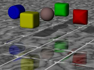
To complete our scene, let's add five different superellipsoids, each a different color, so that they hover over our tiles and are reflected in them.
  superellipsoid {
    <0.1, 1>
    pigment { Red }
    translate <5, 3, 0>
    scale .45
  }
  superellipsoid {
    <1, 0.25>
    pigment { Blue }
    translate <-5, 3, 0>
    scale .45
  }
  superellipsoid {
    <0.2, 0.6>
    pigment { Green }
    translate <0, 3, 5>
    scale .45
  }
  superellipsoid {
    <0.25, 0.25>
    pigment { Yellow }
    translate <0, 3, -5>
    scale .45
  }
  superellipsoid {
    <1, 1>
    pigment { Pink }
    translate y*3
    scale .45
  }
We trace the scene at 320x200 -A to see the result. If we are
happy with that, we do a final trace at 640x480 +A0.2.
Advanced Texture Options
The extremely powerful texturing ability is one thing that really sets POV-Ray apart from other raytracers. So far we have not really tried anything too complex but by now we should be comfortable enough with the program's syntax to try some of the more advanced texture options.
Obviously, we cannot try them all. It would take a tutorial a lot more pages to use every texturing option available in POV-Ray. For this limited tutorial, we will content ourselves to just trying a few of them to give an idea of how textures are created. With a little practice, we will soon be creating beautiful textures of our own.
Note: early versions of POV-Ray made a distinction between pigment and
normal patterns, i. e. patterns that could be used inside a
normal or pigment statement. Since POV-Ray 3.0 this
restriction was removed so that all patterns listed in section
"Patterns" can be used as a pigment or normal pattern.
Pigments
Every surface must have a color. In POV-Ray this color is called a pigment.
It does not have to be a single color. It can be a color pattern, a color
list or even an image map. Pigments can also be layered one on top of the next
so long as the uppermost layers are at least partially transparent so the ones
beneath can show through. Let's play around with some of these kinds of
pigments.
We create a file called texdemo.pov and edit it as
follows:
  #include "colors.inc"
  camera {
    location <1, 1, -7>
    look_at 0
    angle 36
  }
  light_source { <1000, 1000, -1000> White }
  plane {
    y, -1.5
    pigment { checker Green, White }
  }
  sphere {
    <0,0,0>, 1
    pigment { Red }
  }
Giving this file a quick test render at 200x150 -A we see
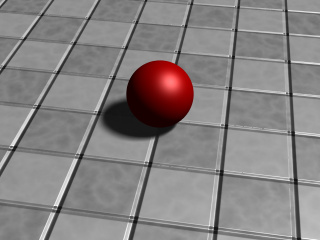
that it is a simple red sphere against a green and white checkered plane. We
will be using the sphere for our textures.
Using Color List Pigments
Before we begin we should note that we have already made one kind of
pigment, the color list pigment. In the previous example we have used a
checkered pattern on our plane. There are three other kinds of color list
pigments, brick, hexagon and the
object pattern.
Let's quickly try each of these. First, we change the plane's
pigment as follows:
pigment { hexagon Green, White, Yellow }
Rendering this we see a three-color hexagonal pattern. Note that this pattern requires three colors. Now we change the pigment to...
pigment { brick Gray75, Red rotate -90*x scale .25 }
Looking at the resulting image we see that the plane now has a brick pattern. We note that we had to rotate the pattern to make it appear correctly on the flat plane. This pattern normally is meant to be used on vertical surfaces. We also had to scale the pattern down a bit so we could see it more easily. We can play around with these color list pigments, change the colors, etc. until we get a floor that we like.
Using Pigment and Patterns
Let's begin texturing our sphere by using a pattern and a color map consisting of three colors. We replace the pigment block with the following.
  pigment {
    gradient x
    color_map {
      [0.00 color Red]
      [0.33 color Blue]
      [0.66 color Yellow]
      [1.00 color Red]
    }
  }
Rendering this we see that the gradient pattern gives us an
interesting pattern of vertical stripes. We change the gradient direction to
y. The stripes are horizontal now. We change the gradient direction to z. The
stripes are now more like concentric rings. This is because the gradient
direction is directly away from the camera. We change the direction back to x
and add the following to the pigment block.
  pigment {
    gradient x
    color_map {
      [0.00 color Red]
      [0.33 color Blue]
      [0.66 color Yellow]
      [1.00 color Red]
    }
    rotate -45*z          // <- add this line
  }
The vertical bars are now slanted at a 45 degree angle. All patterns can
be rotated, scaled and translated in this manner. Let's now try some
different types of patterns. One at a time, we substitute the following
keywords for gradient x and render to see the result: bozo,
marble, agate, granite,
leopard, spotted and wood
(if we like we can test all patterns listed in section "Patterns").
Rendering these we see that each results in a slightly different pattern. But to get really good results each type of pattern requires the use of some pattern modifiers.
Using Pattern Modifiers
Let's take a look at some pattern modifiers. First, we change the pattern type to bozo. Then we add the following change.
  pigment {
    bozo
    frequency 3            // <- add this line
    color_map {
      [0.00 color Red]
      [0.33 color Blue]
      [0.66 color Yellow]
      [1.00 color Red]
    }
    rotate -45*z
  }
The frequency modifier determines the number of times the
color map repeats itself per unit of size. This change makes the bozo
pattern we saw earlier have many more bands in it. Now we change
the pattern type to marble. When we rendered this earlier, we
saw a banded pattern similar to gradient y that really did not
look much like marble at all. This is because marble really is a kind of
gradient and it needs another pattern modifier to look like marble. This
modifier is called turbulence. We change the line
frequency 3 to turbulence 1 and render again. That's
better! Now let's put frequency 3 back in right after the
turbulence and take another look. Even more interesting!
But wait, it gets better! Turbulence itself has some modifiers of its own.
We can adjust the turbulence several ways. First, the float that follows the
turbulence keyword can be any value with higher values giving
us more turbulence. Second, we can use the keywords omega,
lambda and octaves
to change the turbulence parameters.
Let's try this now:
  pigment {
    marble
    turbulence 0.5
    lambda 1.5
    omega 0.8
    octaves 5
    frequency 3
    color_map {
      [0.00 color Red]
      [0.33 color Blue]
      [0.66 color Yellow]
      [1.00 color Red]
    }
    rotate 45*z
  }
Rendering this we see that the turbulence has changed and the pattern looks different. We play around with the numerical values of turbulence, lambda, omega and octaves to see what they do.
Using Transparent Pigments and Layered Textures
Pigments are described by numerical values that give the rgb value of the
color to be used (like color rgb<1,0,0> giving us a red
color). But this syntax will give us more than just the rgb values. We can
specify filtering transparency by changing it as follows: color
rgbf<1,0,0,1>. The f stands for filter,
POV-Ray's word for filtered transparency. A value of one means that the
color is completely transparent, but still filters the light according to
what the pigment is. In this case, the color will be a transparent red, like
red cellophane.
There is another kind of transparency in POV-Ray. It is called transmittance
or non-filtering transparency (the keyword is transmit;
see also rgbt).
It is different from filter in that it does not filter the light according
to the pigment color. It instead allows all the light to pass through unchanged. It can
be specified like this: rgbt <1,0,0,1>.
Let's use some transparent pigments to create another kind of texture, the layered texture. Returning to our previous example, declare the following texture.
  #declare LandArea = texture {
      pigment {
        agate
        turbulence 1
        lambda 1.5
        omega .8
        octaves 8
        color_map {
          [0.00 color rgb <.5, .25, .15>]
          [0.33 color rgb <.1, .5, .4>]
          [0.86 color rgb <.6, .3, .1>]
          [1.00 color rgb <.5, .25, .15>]
        }
      }
    }
This texture will be the land area. Now let's make the oceans by declaring the following.
  #declare OceanArea = texture {
      pigment {
        bozo
        turbulence .5
        lambda 2
        color_map {
          [0.00, 0.33 color rgb <0, 0, 1>
                      color rgb <0, 0, 1>]
          [0.33, 0.66 color rgbf <1, 1, 1, 1>
                      color rgbf <1, 1, 1, 1>]
          [0.66, 1.00 color rgb <0, 0, 1>
                      color rgb <0, 0, 1>]
        }
      }
    }
Note: how the ocean is the opaque blue area and the land is the clear area which will allow the underlying texture to show through.
Now, let's declare one more texture to simulate an atmosphere with swirling clouds.
  #declare CloudArea = texture {
    pigment {
      agate
      turbulence 1
      lambda 2
      frequency 2
      color_map {
        [0.0 color rgbf <1, 1, 1, 1>]
        [0.5 color rgbf <1, 1, 1, .35>]
        [1.0 color rgbf <1, 1, 1, 1>]
      }
    }
  }
Now apply all of these to our sphere.
  sphere {
    <0,0,0>, 1
    texture { LandArea }
    texture { OceanArea }
    texture { CloudArea }
  }
We render this and have a pretty good rendition of a little planetoid. But it could be better. We do not particularly like the appearance of the clouds. There is a way they could be done that would be much more realistic.
Using Pigment Maps
Pigments may be blended together in the same way as the colors in a color
map using the same pattern keywords and a pigment_map. Let's
just give it a try.
We add the following declarations, making sure they appear before the other declarations in the file.
  #declare Clouds1 = pigment {
      bozo
      turbulence 1
      color_map {
        [0.0 color White filter 1]
        [0.5 color White]
        [1.0 color White filter 1]
      }
    }
  #declare Clouds2 = pigment {
    agate
    turbulence 1
    color_map {
      [0.0 color White filter 1]
      [0.5 color White]
      [1.0 color White filter 1]
      }
    }
  #declare Clouds3 = pigment {
    marble
    turbulence 1
    color_map {
      [0.0 color White filter 1]
      [0.5 color White]
      [1.0 color White filter 1]
    }
  }
  #declare Clouds4 = pigment {
    granite
    turbulence 1
    color_map {
      [0.0 color White filter 1]
      [0.5 color White]
      [1.0 color White filter 1]
    }
  }
Now we use these declared pigments in our cloud layer on our planetoid. We replace the declared cloud layer with.
  #declare CloudArea = texture {
    pigment {
      gradient y
      pigment_map {
        [0.00 Clouds1]
        [0.25 Clouds2]
        [0.50 Clouds3]
        [0.75 Clouds4]
        [1.00 Clouds1]
      }
    }
  }
We render this and see a remarkable pattern that looks very much like weather patterns on the planet earth. They are separated into bands, simulating the different weather types found at different latitudes.
Normals
Objects in POV-Ray have very smooth surfaces. This is not very realistic so there are several ways to disturb the smoothness of an object by perturbing the surface normal. The surface normal is the vector that is perpendicular to the angle of the surface. By changing this normal the surface can be made to appear bumpy, wrinkled or any of the many patterns available. Let's try a couple of them.
Using Basic Normal Modifiers
We comment out the planetoid sphere for now and, at the bottom of the file, create a new sphere with a simple, single color texture.
  sphere {
    <0,0,0>, 1
    pigment { Gray75 }
    normal { bumps 1 scale .2 }
  }
Here we have added a normal block in addition to the
pigment block (note that these do not have to be included in a
texture block unless they need to be transformed together or need to
be part of a layered texture). We render this to see what it looks like. Now,
one at a time, we substitute for the keyword bumps the following
keywords: dents, wrinkles,
ripples and waves
(we can also use any of the patterns listed in "Patterns").
We render each to see what they look like. We play around with the float value that follows the
keyword. We also experiment with the scale value.
For added interest, we change the plane texture to a single color with a normal as follows.
  plane {
    y, -1.5
    pigment { color rgb <.65, .45, .35> }
    normal { dents .75 scale .25 }
  }
Blending Normals
Normals can be layered similar to pigments but the results can be unexpected. Let's try that now by editing the sphere as follows.
  sphere {
    <0,0,0>, 1
    pigment { Gray75 }
      normal { radial frequency 10 }
      normal { gradient y scale .2 }
  }
As we can see, the resulting pattern is neither a radial nor a gradient. It is instead the result of first calculating a radial pattern and then calculating a gradient pattern. The results are simply additive. This can be difficult to control so POV-Ray gives the user other ways to blend normals.
One way is to use normal maps. A normal map works the same way as the pigment map we used earlier. Let's change our sphere texture as follows.
  sphere {
    <0,0,0>, 1
    pigment { Gray75 }
    normal {
      gradient y
      frequency 3
      turbulence .5
      normal_map {
        [0.00 granite]
        [0.25 spotted turbulence .35]
        [0.50 marble turbulence .5]
        [0.75 bozo turbulence .25]
        [1.00 granite]
      }
    }
  }
Rendering this we see that the sphere now has a very irregular bumpy surface. The gradient pattern type separates the normals into bands but they are turbulated, giving the surface a chaotic appearance. But this gives us an idea.
Suppose we use the same pattern for a normal map that we used to create the oceans on our planetoid and applied it to the land areas. Does it follow that if we use the same pattern and modifiers on a sphere the same size that the shape of the pattern would be the same? Would not that make the land areas bumpy while leaving the oceans smooth? Let's try it. First, let's render the two spheres side-by-side so we can see if the pattern is indeed the same. We un-comment the planetoid sphere and make the following changes.
  sphere {
    <0,0,0>, 1
    texture { LandArea }
    texture { OceanArea }
    //texture { CloudArea }  // <-comment this out
    translate -x             // <- add this transformation
  }
Now we change the gray sphere as follows.
  sphere {
    <0,0,0>, 1
    pigment { Gray75 }
    normal {
      bozo
      turbulence .5
      lambda 2
      normal_map {
        [0.4 dents .15 scale .01]
        [0.6 agate turbulence 1]
        [1.0 dents .15 scale .01]
      }
    }
    translate x // <- add this transformation
  }
We render this to see if the pattern is the same. We see that indeed it
is. So let's comment out the gray sphere and add the normal
block it contains to the land area texture of our planetoid. We remove the
transformations so that the planetoid is centered in the scene again.
  #declare LandArea = texture {
    pigment {
      agate
      turbulence 1
      lambda 1.5
      omega .8
      octaves 8
      color_map {
        [0.00 color rgb <.5, .25, .15>]
        [0.33 color rgb <.1, .5, .4>]
        [0.86 color rgb <.6, .3, .1>]
        [1.00 color rgb <.5, .25, .15>]
      }
    }
    normal {
      bozo
      turbulence .5
      lambda 2
      normal_map {
        [0.4 dents .15 scale .01]
        [0.6 agate turbulence 1]
        [1.0 dents .15 scale .01]
      }
    }
  }
Looking at the resulting image we see that indeed our idea works! The land areas are bumpy while the oceans are smooth. We add the cloud layer back in and our planetoid is complete.
There is much more that we did not cover here due to space constraints. On our own, we should take the time to explore slope maps, average and bump maps.
Slope Map Tutorial
One of the most powerful texturing features of POV-Ray is normal perturbation (which is specified using the normal block of an object texture). With this feature it's possible to emulate small surface displacement in a very efficient way, without actually having to modify the actual surface (which often would increase the complexity of the object considerably, resulting in much slower renders).
Slope maps are used to define more precisely how the normal perturbation is generated from a specified pattern. Slope maps are a very powerful feature often dismissed by many.
As an example, let's create a simple scene with an object using normal perturbation:
camera { location <0, 10, -7>*1.4 look_at 0 angle 35 }
light_source
{ <100, 80, -30>, 1 area_light z*20, y*20, 12, 12 adaptive 0 }
plane { y, 0 pigment { rgb 1 } }

cylinder
{ 0, y, 4
  pigment { rgb <1, .9, .2> }
  finish { specular 1 }
  normal
  { wood 1
    rotate x*90
  }
}
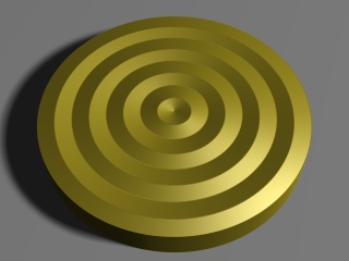
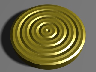
By default the wood pattern uses a ramp wave (going from 0 to 1 and then back to 0) arranged in concentric circles, as we can see from the image.
By default POV-Ray simply takes the values of the pattern as they are in order to calculate the normal perturbation of the surface. However, using a slope_map we can more precisely define how these values are interpreted. For example, if we add this slope_map (the meaning of the values are explained later in this tutorial) to the normal block in the example above:
    slope_map
    { [0 <0, 0>]
      [.2 <1, 1>]
      [.2 <1, 0>]
      [.8 <1, 0>]
      [.8 <1, -1>]
      [1 <0, 0>]
    }
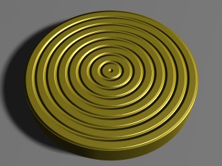
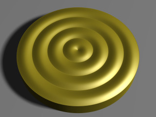
we get a much more interesting result:
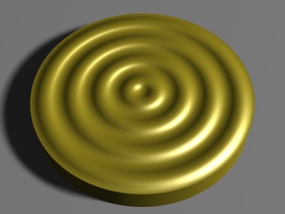
We can also use a slope map to simply smooth out the original ramp wave pattern like this:
    slope_map
    { [0 <0, 0>]
      [.5 <.5, 1>]
      [1 <1, 0>]
    }
Slopes, what are they?
Mathematically speaking the slope of a curve (also called gradient) at a certain point is the tan() of the angle of the tangent line of that curve at that point. In other words, it's the amount of change of the vertical coordinate with respect to the change of the horizontal coordinate.
In a more colloquial way, the slope of a completely horizontal part of the curve is 0. The slope of a 45-degree line is 1 (because for each unit in the horizontal direction the line goes up by the same amount). Lines between 0 and 45 degrees have corresponding slopes between 0 and 1 (the relation between them is not linear, though, but one usually doesn't have to worry about that). Lines with an angle of over 45 degrees have correspondently slopes increasingly larger than 1 (a line of 90 degrees has an infinite slope).
Usually when defining slope maps it's enough to keep between slopes of 0 and 1, even though higher slopes are sometimes useful too to get steeper changes. Usually it's enough to think that a slope of 0 means a horizontal part of the curve while a slope of 1 means a 45-degree steep part of the curve (and slopes between 0 and 1 correspond to degrees between 0 and 45 respectively).
A slope can be negative too. A negative slope simply means that the curve is going down instead of going up.
The following figure shows some basic slopes in a curve (note that the slope values are only approximate):
Syntax of a slope map
In the exact same way as for example a color_map assigns colors to pattern values, a slope_map assign slopes to pattern values. If you are fluent in defining color maps for a pattern, defining a slope map shouldn't be any more difficult.
Each entry in a slope map takes two values: The "displacement" of the surface (although one should remember that this displacement is only simulated, not real) and the slope of the surface at that point.
You can think of the first parameter as an "altitude" value which tells how much the surface (in relative terms) is displaced from its original location. Usually values between 0 and 1 are used for this. You can think of 0 meaning that the surface is not displaced and 1 as the surface having maximum displacement (outwards).
Let's examine the slope map we used to "smooth out" the wood pattern at the beginning of this tutorial:
    slope_map
    { [0 <0, 0>]
      [.5 <.5, 1>]
      [1 <1, 0>]
    }
This means:
- When the pattern has a value of 0, the surface is not displaced and the slope of the surface is 0 (ie. it's horizontal).
- When the pattern has a value of 0.5, the surface is displaced by 0.5 and the slope of the surface is 1.
- When the pattern has a value of 1, the surface has maximum displacement and the slope is again 0, ie. horizontal.
When the pattern is linear (as the wood pattern is), this kind of slope map corresponds approximately to a half sine wave. Since the wood pattern uses a ramp wave (ie. after going from 0 to 1 it then goes from 1 to 0), the result is basically a complete (approximate) sine wave.
As with a color map, all the values in between are interpolated and that's why we get a smooth transition between these values.
Examples of slope maps
As we saw in the first slope map example in this tutorial, it is possible to create sharp transitions, not just smooth ones. This is achieved in the same way as how sharp transitions are achieved with color maps: By repeating the same pattern value. Here is an example:
    slope_map
    { [0 <0, 1>]
      [.5 <1, 1>]
      [.5 <1, -.3>]
      [1 <.7, -.3>]
    }
There's a sharp transition at the pattern value 0.5, where the surface goes from slope 1 to slope -0.3 (ie. from going strongly upwards to going slightly downwards). Due to how the wood pattern repeats itself, there are also sharp transitions at the pattern values 0 and 1.
We can combine sharp and smooth transitions for nice effects. For example, this simple slope map achieves a nice result:
    slope_map
    { [0 <0, 1>]
      [1 <1, 0>]
    }
- At the pattern value 0 the "displacement" of the surface is 0 and the slope is 1 (ie. strongly upwards).
- At the pattern value 1 the surface is fully "displaced" and horizontal.
- Due to the ramp-wave-repetition quality of the wood pattern (which effectively reverses this pattern), the surface then continues smoothly from this point until it "descends" to 0, where the slope is now effectively -1. Now there's a sharp transition from -1 back to 1 as the pattern starts over.
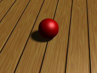
One application where slope maps are really useful is when creating tiled floors. When the tiles on a floor are not too close to the camera and there is a very large amount of tiles, instead of creating hundreds or thousands of individual tile objects, it may be more efficient to simply create a normal pattern which emulates the tiles.
This example shows how to create a floor made of wooden "e;planks"e;:
camera { location <2, 10, -12>*.5 look_at 0 angle 35 }
light_source
{ <100, 150, 0>, 1 area_light z*40, y*40, 12, 12 adaptive 0 }
sphere { y*.5, .5 pigment { rgb x } finish { specular .5 } }

plane
{ y, 0
  pigment
  { wood color_map { [0 rgb <.9,.7,.3>][1 rgb <.8,.5,.2>] }
    turbulence .5
    scale <1, 1, 20>*.2
  }
  finish { specular 1 }
  normal
  { gradient x 1
    slope_map
    { [0 <0, 1>] // 0 height, strong slope up
      [.05 <1, 0>] // maximum height, horizontal
      [.95 <1, 0>] // maximum height, horizontal
      [1 <0, -1>] // 0 height, strong slope down
    }
  }
}
In this case a gradient pattern was used. Since the gradient pattern goes from 0 to 1 and then immediately back to 0, we have to mirror the slope map (around 0.5) in order to get a repetitive symmetric result.
In this example the slope map starts from 0 height and a strong slope up, and goes quickly to maximum height, where the surface is horizontal. Then there's a large horizontal area (from pattern value 0.5 to 0.95) after which the slope goes rapidly back down to 0 height and a strong slope down. (After this there's a sharp transition to the beginning due to the gradient pattern starting over.)
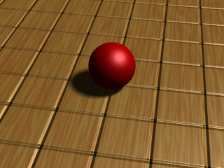
If we want square tiles instead of just "planks", we can achieve that by eg. using an average normal map like this:
  #declare TileNormal =
    normal
    { gradient x 2 // Double the strength because of the averaging
      slope_map
      { [0 <0, 1>] // 0 height, strong slope up
        [.05 <1, 0>] // maximum height, horizontal
        [.95 <1, 0>] // maximum height, horizontal
        [1 <0, -1>] // 0 height, strong slope down
      }
    }
  normal
  { average normal_map
    { [1 TileNormal]
      [1 TileNormal rotate y*90]
    }
  }
If we change the pigment of the plane a bit, we get a nice tiled floor:
  pigment
  { checker
    pigment { granite color_map { [0 rgb 1][1 rgb .9] } }
    pigment { granite color_map { [0 rgb .9][1 rgb .7] } }
  }
As you can see in the image, close to the camera it's more evident that the tiles are not truely three-dimensional (and that only a normal perturbation trick has been used), but farther away from the camera the effect is pretty convincing.
Finishes
The final part of a POV-Ray texture is the finish. It
controls the properties of the surface of an object. It can make it shiny and
reflective, or dull and flat. It can also specify what happens to light that
passes through transparent pigments, what happens to light that is scattered
by less-than-perfectly-smooth surfaces and what happens to light that is
reflected by surfaces with thin-film interference properties. There are
twelve different properties available in POV-Ray to specify the finish of a
given object. These are controlled by the following keywords: ambient,
diffuse, brilliance,
phong, specular,
metallic, reflection,
crand and iridescence.
Let's design a couple of textures that make use of these parameters.
Using Ambient
Since objects in POV-Ray are illuminated by light sources, the portions of
those objects that are in shadow would be completely black were it not for
the first two finish properties, ambient and
diffuse. Ambient is used to simulate the light that is scattered
around the scene that does not come directly from a light source. Diffuse
determines how much of the light that is seen comes directly from a light
source. These two keywords work together to control the simulation of ambient
light. Let's use our gray sphere to demonstrate this. Let's also
change our plane back to its original green and white checkered pattern.
  plane {
    y, -1.5
    pigment {checker Green, White}
  }
  sphere {
    <0,0,0>, 1
    pigment { Gray75 }
    finish {
      ambient .2
      diffuse .6
    }
  }
In the above example, the default values for ambient and diffuse are used. We render this to see what the effect is and then make the following change to the finish.
  ambient 0
  diffuse 0
The sphere is black because we have specified that none of the light
coming from any light source will be reflected by the sphere. Let's
change diffuse back to the default of 0.6.
Now we see the gray surface color where the light from the light source
falls directly on the sphere but the shaded side is still absolutely black.
Now let's change diffuse to 0.3 and ambient to
0.3.
The sphere now looks almost flat. This is because we have specified a fairly
high degree of ambient light and only a low amount of the light coming from
the light source is diffusely reflected towards the camera. The default
values of ambient and diffuse are pretty good
averages and a good starting point. In most cases, an ambient value of 0.1
... 0.2 is sufficient and a diffuse value of 0.5 ... 0.7 will usually do the
job. There are a couple of exceptions. If we have a completely transparent
surface with high refractive and/or reflective values, low values of both
ambient and diffuse may be best. Here is an example:
sphere {
   <0,0,0>, 1
   pigment { White filter 1 }
   finish {
      ambient 0
      diffuse 0
      reflection .25
      specular 1
      roughness .001
   }
   interior { ior 1.33 }
}
This is glass, obviously. Glass is a material that takes nearly all of its
appearance from its surroundings. Very little of the surface is seen because
it transmits or reflects practically all of the light that shines on it. See
glass.inc for some other examples.
If we ever need an object to be completely illuminated independently of the
lighting situation in a given scene we can do this artificially by specifying
an ambient value of 1 and a diffuse value of 0.
This will eliminate all shading and simply give the object its fullest and
brightest color value at all points. This is good for simulating objects that
emit light like light bulbs and for skies in scenes where the sky may not be
adequately lit by any other means.
Let's try this with our sphere now.
  sphere {
     <0,0,0>, 1
     pigment { White }
     finish {
        ambient 1
        diffuse 0
     }
  }
Rendering this we get a blinding white sphere with no visible highlights or shaded parts. It would make a pretty good street light.
| Writing the polynomial vector | Using Surface Highlights |
|
This document is protected, so submissions, corrections and discussions should be held on this documents talk page. |
