Documentation:Tutorial Section 3.6
|
This document is protected, so submissions, corrections and discussions should be held on this documents talk page. |
Using Atmospheric Effects
The Fog
Using Multiple Layers of Fog
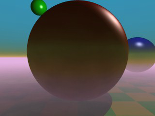
It is possible to use several layers of fog by using more than one fog statement in your scene file. This is quite useful if you want to get nice effects using turbulent ground fogs. You could add up several, differently colored fogs to create an eerie scene for example.
Just try the following example (fog6.pov).
  fog {
    distance 150
    color rgb<0.3, 0.5, 0.2>
    fog_type 2
    fog_offset 25
    fog_alt 1
    turbulence 0.1
    turb_depth 0.2
  }
  fog {
    distance 150
    color rgb<0.5, 0.1, 0.1>
    fog_type 2
    fog_offset 15
    fog_alt 4
    turbulence 0.2
    turb_depth 0.2
  }
  fog {
    distance 150
    color rgb<0.1, 0.1, 0.6>
    fog_type 2
    fog_offset 10
    fog_alt 2
  }
You can combine constant density fogs, ground fogs, filtering fogs, non-filtering fogs, fogs with a translucency threshold, etc.
Fog and Hollow Objects
Whenever you use the fog feature and the camera is inside a non-hollow object you will not get any fog effects. For a detailed explanation why this happens see Empty and Solid Objects.
In order to avoid this problem you have to make all those objects hollow by
either making sure the camera is outside these objects (using the inverse
keyword) or by adding the hollow to them (which is much easier).
The Rainbow
The rainbow feature can be used
to create rainbows and maybe other more strange effects. The rainbow is a fog
like effect that is restricted to a cone-like volume.
Starting With a Simple Rainbow
The rainbow is specified with a lot of parameters: the angle under which it is visible, the width of the color band, the direction of the incoming light, the fog-like distance based particle density and last but not least the color map to be used.
The size and shape of the rainbow are determined by the angle
and width keywords. The width
keyword is used to set the direction of the incoming light, thus setting the
rainbow's position. The rainbow is visible when the angle between the direction
vector and the incident light direction is larger than angle-width/2 and smaller
than angle+width/2.
The incoming light is the virtual light source that is responsible for the rainbow. There need not be a real light source to create the rainbow effect.
The rainbow is a fog-like effect, i.e. the rainbow's color is mixed with the background color based on the distance to the intersection point. If you choose small distance values the rainbow will be visible on objects, not just in the background. You can avoid this by using a very large distance value.
The color map is the crucial part of the rainbow since it contains all the colors that normally can be seen in a rainbow. The color of the innermost color band is taken from the color map entry 0 while the outermost band is take from entry 1. You should note that due to the limited color range any monitor can display it is impossible to create a real rainbow. There are just some colors that you cannot display.
The filter channel of the rainbow's color map is used in the same way as with fogs. It determines how much of the light passing through the rainbow is filtered by the color.
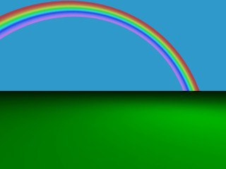
The following example shows a simple scene with a ground plane, three
spheres and a somewhat exaggerated rainbow (rainbow1.pov).
  #include "colors.inc"
  camera {
    location <0, 20, -100>
    look_at <0, 25, 0>
    angle 80
  }
  background { color SkyBlue }
  plane { y, -10 pigment { color Green } }
  light_source { <100, 120, 40> color White }
  // declare rainbow's colors
  #declare r_violet1 = color rgbf<1.0, 0.5, 1.0, 1.0>;
  #declare r_violet2 = color rgbf<1.0, 0.5, 1.0, 0.8>;
  #declare r_indigo  = color rgbf<0.5, 0.5, 1.0, 0.8>;
  #declare r_blue    = color rgbf<0.2, 0.2, 1.0, 0.8>;
  #declare r_cyan    = color rgbf<0.2, 1.0, 1.0, 0.8>;
  #declare r_green   = color rgbf<0.2, 1.0, 0.2, 0.8>;
  #declare r_yellow  = color rgbf<1.0, 1.0, 0.2, 0.8>;
  #declare r_orange  = color rgbf<1.0, 0.5, 0.2, 0.8>;
  #declare r_red1    = color rgbf<1.0, 0.2, 0.2, 0.8>;
  #declare r_red2    = color rgbf<1.0, 0.2, 0.2, 1.0>;
  // create the rainbow
  rainbow {
    angle 42.5
    width 5
    distance 1.0e7
    direction <-0.2, -0.2, 1>
    jitter 0.01
    color_map {
      [0.000  color r_violet1]
      [0.100  color r_violet2]
      [0.214  color r_indigo]
      [0.328  color r_blue]
      [0.442  color r_cyan]
      [0.556  color r_green]
      [0.670  color r_yellow]
      [0.784  color r_orange]
      [0.900  color r_red1]
    }
  }
Some irregularity is added to the color bands using the jitter keyword.
The rainbow in our sample is much too bright. You will never see a rainbow like this in reality. You can decrease the rainbow's colors by decreasing the RGB values in the color map.
Increasing the Rainbow's Translucency
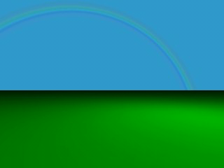
The result we have so far looks much too bright. Just reducing the rainbow's color helps but it is much better to increase the translucency of the rainbow because it is more realistic if the background is visible through the rainbow.
We can use the transmittance channel of the colors in the color map to
specify a minimum translucency, just like we did with the fog. To get
realistic results we have to use very large transmittance values as you can
see in the following example (rainbow2.pov).
  rainbow {
    angle 42.5
    width 5
    distance 1.0e7
    direction <-0.2, -0.2, 1>
    jitter 0.01
    color_map {
      [0.000  color r_violet1 transmit 0.98]
      [0.100  color r_violet2 transmit 0.96]
      [0.214  color r_indigo  transmit 0.94]
      [0.328  color r_blue    transmit 0.92]
      [0.442  color r_cyan    transmit 0.90]
      [0.556  color r_green   transmit 0.92]
      [0.670  color r_yellow  transmit 0.94]
      [0.784  color r_orange  transmit 0.96]
      [0.900  color r_red1    transmit 0.98]
    }
  }
The transmittance values increase at the outer bands of the rainbow to make it softly blend into the background.
The resulting image looks much more realistic than our first rainbow.
Using a Rainbow Arc
Currently our rainbow has a circular shape, even though most of it is
hidden below the ground plane. You can easily create a rainbow arc by using
the arc_angle keyword with an angle below 360 degrees.
If you use arc_angle 120 for example you will get a rainbow
arc that abruptly vanishes at the arc's ends. This does not look good. To
avoid this the falloff_angle keyword can be used to specify a
region where the arc smoothly blends into the background.
As explained in the rainbow's reference section (see Rainbow) the arc extends from -arc_angle/2 to arc_angle/2 while
the blending takes place from -arc_angle/2 to -falloff_angle/2 and
falloff_angle/2 to arc_angle/2. This is the reason why the falloff_angle
has to be smaller or equal to the arc_angle.
In the following examples we use an 120 degrees arc with a 45 degree falloff
region on both sides of the arc (rainbow3.pov).
  rainbow {
    angle 42.5
    width 5
    arc_angle 120
    falloff_angle 30
    distance 1.0e7
    direction <-0.2, -0.2, 1>
    jitter 0.01
    color_map {
      [0.000  color r_violet1 transmit 0.98]
      [0.100  color r_violet2 transmit 0.96]
      [0.214  color r_indigo  transmit 0.94]
      [0.328  color r_blue    transmit 0.92]
      [0.442  color r_cyan    transmit 0.90]
      [0.556  color r_green   transmit 0.92]
      [0.670  color r_yellow  transmit 0.94]
      [0.784  color r_orange  transmit 0.96]
      [0.900  color r_red1    transmit 0.98]
    }
  }
The arc angles are measured against the rainbows up direction which can be
specified using the up keyword. By default the up direction is
the y-axis.
We finally have a realistic looking rainbow arc.
Simple Media Tutorial
Media in POV-Ray is a very versatile feature and can be used for a very diverse set of special effects such as glows, smoke, dust, fog, etc. However, due to its versatility, media is not one of the easiest and simplest features of POV-Ray and often requires experience for getting things to look good.
Types of media
There are three types of media in POV-Ray: Emitting, absorbing and scattering. They have the following properties:
- Emitting: This is an additive media, which is handled as if it only emits
light (note: it does not emit light to its surroundings like a
light_sourcedoes; this just describes how it affects the rays going through it). That is, the color of the media is added to the color of the ray passing through it. Light sources do not have any effect at all in it (ie. it does not affect shadows in any way). - Absorbing: This is a substractive media. This media substracts (absorbs) its coloration from the ray passing through it. Light sources are taken into account only in the shadow of the media (that is, absorbing media casts a shadow).
- Scattering: This is the most advanced media type as it fully takes into account light passing through it. That is, this media is lit by light sources (and thus, for example, nearby objects can cast shadows into the scattering media).
Emitting and absorbing medias are the simplest and thus fastest ones.
Emitting media can be used for things like glows, lasers, sparkles and similar
light-emitting effects. Absorbing media can be used for things like smoke and
fog (the difference between the fog feature of POV-Ray is that the
density of an absorbing media can be modified by a pattern and the media can be
contained inside an object).
Scattering media is the more advanced and slower type. It is somewhat similar to absorbing media except that it is fully lit by light sources. This can be used for smoke or fog with visible lightbeams and shadows.
Some media concepts
Media can be global to the whole universe, or it can be contained by an
object. In the latter case the media is defined in the interior
block of the object definition.
For an object to be able to contain media (or to allow media from other
objects or the global media inside itself) it has to be defined as
hollow (a common mistake is to forget adding this keyword). If an
object with no media should not allow media inside itself (eg. a solid glass
ball), then hollow should not be defined for that object.
If media is defined in the interior of an object or as a global
media it will have a constant density throughout the object/universe. However, a
density pattern can be specified for non-uniform media. Also all kinds of
transformations can be applied to the media. This is specially useful for
various effects (such as smoke with certain shape).
Simple media examples
Emitting media
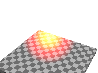
Let's start with a very simple scene showing an emitting media using a
spherical density map. Emitting media is used with the emission
keyword followed by a color value. This color value tells the overall color of
the media:
 global_settings { assumed_gamma 1 }
 background { rgb 1 }
 camera { location <3,4,-5>*.8 look_at 0 angle 35 }
 light_source { <20,40,10>, 1 }

 box // floor
 { <-1.5,-1.01,-1.5>, <1.5,-1.2,1.5>
   pigment { checker rgb 0.75, rgb 0.25 scale 0.2 }
 }

 sphere // transparent sphere containing media
 { 0,1 pigment { rgbt 1 } hollow
   interior
   { media
     { emission 1
       density
       { spherical density_map
         { [0 rgb 0]
           [0.4 rgb <1,0,0>]
           [0.8 rgb <1,1,0>]
           [1 rgb 1]
         }
       }
     }
  }
 }
Note: The spherical pattern gets values from 0 in the outer
surface of a unit sphere to 1 in the origin (that is, the density with the index
value 1 will be the density at the center of the media).
The color values in the density map tell what color the media is emitting at
a certain point in the pattern. That is, for example when the pattern gets the
value 0.4, the media will be completely red at that place. If the color is
<0,0,0>, it means that the media does not emit any light at
all in that location.
Note: The density map colors are multiplied by the color given with the emission keyword; since 1 is used in this case, the density map colors are not affected.
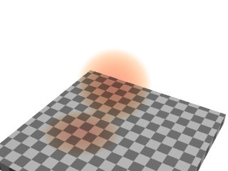
Thus, this will give us a media with a bright white center which fades to yellow and red at the outer limits of the unit sphere:
As you can see from the image, the emitting media is invisible against white background. This is due to its additive nature (any color added to pure white gives pure white). In fact, emitting media gives usually best results for dark backgrounds.
Absorbing media
Modifying the previous example to use absorbing media is rather simple:
Simply change the emission keyword for absorption.
However, the colors we used above are not very illustrative for absorbing media,
so let's change them a bit like this:
    media
    { absorption 1
      density
      { spherical density_map
        { [0 rgb 0]
          [0.4 rgb 0]
          [0.5 rgb <0,0.5,1>]
          [1 rgb <0,1,1>]
        }
      }
    }
The feature which we immediately notice in the image is that the media seems
to be inverted from the colors specified in the density map: Blueish colors were
specified in the map, but the image shows a reddish media. This is perfectly
normal and to be expected from the substractive nature of absorbing media: The
media actually absorbs the colors we specified in the density map. This means
that for example specifying a white color (<1,1,1>) in the
density map will absorb all colors, thus resulting in a dark media.
See how this media has a shadow: light rays passing through the media are absorbed.
Because of its subtractive nature, absorbing media works well with light backgrounds and not very well with dark ones.
Scattering media
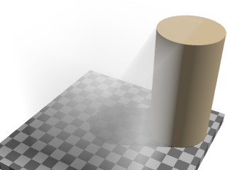
Since scattering media fully takes light sources into account we need to make a slightly more complex scene to see this. Let's modify the above example by replacing the sphere with a box containing evenly distributed scattering media, and a cylinder which will cast a shadow onto the media:
 box
 { -1,1 pigment { rgbt 1 } hollow
   interior
   { media
     { scattering { 1, 0.5 }
     }
   }
 }
 cylinder
 { <0.9, -1, 0.7>, <0.9, 0.9, 0.7>, 0.5
   pigment { rgb <1, 0.8, 0.5> }
 }
(The effect may look a bit unnatural for a fog effect because the media is contained inside a box and the cylinder is partially out of this box, but this is done to better visualize what is happening.)
The scattering keyword takes more parameters than the other two.
The first number inside the curly brackets is the scattering media type. In this
example we used scattering media type 1. A full list of scattering media types
is given in the section scattering of the Media reference.
The second parameter is the overall color of the media, similar to the parameter of the other two media types.
An optional third parameter can be given with the extinction
keyword inside the curly brackets. This keyword controls how fast the scattering
media absorbs light and has to be used sometimes to get the desired effect, such
as when the media absorbs too much light.
Tip: If you are getting a really dense or dark scattering media, try different values for the color and the extinction value (usually values between 0 and 1). It is usually enough to play with these two values to get the desired effect.
| Using Ground Fog | Multiple medias inside the same object |
|
This document is protected, so submissions, corrections and discussions should be held on this documents talk page. |
